This blog post will guide you through the process of creating a toggle button in Flutter with detailed code examples.
Creating a toggle button in Flutter is a common task for Flutter developers. Toggle buttons are widely used in mobile apps to allow users to switch between two states, such as on/off or active/inactive.
Table of Contents

How to Create a Toggle Button in Flutter?
Flutter provides several ways to create toggle buttons, including using the Switch, ToggleButtons, and CupertinoSwitch widgets. We’ll explore each of these options with code examples to help you understand how to implement them in your Flutter app.
Toggle buttons enhance the user experience by providing a quick and easy way to change settings or preferences without navigating through multiple screens or menus. This is especially useful in settings menus where users need to enable or disable features with a single tap.
1. Using the Switch Widget – Toggle Button in Flutter
The Switch widget is a simple way to create a toggle button. It’s a material design widget that allows users to toggle between on and off states.
import 'package:flutter/material.dart';

void main() => runApp(MyApp());

class MyApp extends StatelessWidget {
  @override
  Widget build(BuildContext context) {
    return MaterialApp(
      home: ToggleButtonExample(),
    );
  }
}

class ToggleButtonExample extends StatefulWidget {
  @override
  _ToggleButtonExampleState createState() => _ToggleButtonExampleState();
}

class _ToggleButtonExampleState extends State<ToggleButtonExample> {
  bool isSwitched = false;

  @override
  Widget build(BuildContext context) {
    return Scaffold(
      appBar: AppBar(
        title: Text('Switch Toggle Button Example'),
      ),
      body: Center(
        child: Switch(
          value: isSwitched,
          onChanged: (value) {
            setState(() {
              isSwitched = value;
            });
          },
        ),
      ),
    );
  }
}
Output:

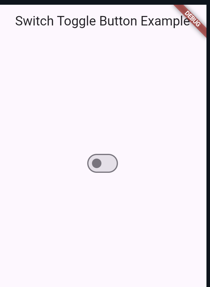
In this example, a Switch widget is used to toggle between two states. The onChanged callback updates the state of the switch.
2. Using the ToggleButtons Widget – Toggle Button in Flutter
The ToggleButtons widget allows you to create a group of toggle buttons. It’s useful when you need multiple toggle buttons that work together.
Example Code
import 'package:flutter/material.dart';

void main() => runApp(MyApp());

class MyApp extends StatelessWidget {
  @override
  Widget build(BuildContext context) {
    return MaterialApp(
      home: ToggleButtonsExample(),
    );
  }
}

class ToggleButtonsExample extends StatefulWidget {
  @override
  _ToggleButtonsExampleState createState() => _ToggleButtonsExampleState();
}

class _ToggleButtonsExampleState extends State<ToggleButtonsExample> {
  List<bool> isSelected = [false, false, false];

  @override
  Widget build(BuildContext context) {
    return Scaffold(
      appBar: AppBar(
        title: Text('ToggleButtons Example'),
      ),
      body: Center(
        child: ToggleButtons(
          isSelected: isSelected,
          onPressed: (int index) {
            setState(() {
              isSelected[index] = !isSelected[index];
            });
          },
          children: <Widget>[
            Icon(Icons.ac_unit),
            Icon(Icons.call),
            Icon(Icons.cake),
          ],
        ),
      ),
    );
  }
}
Output:

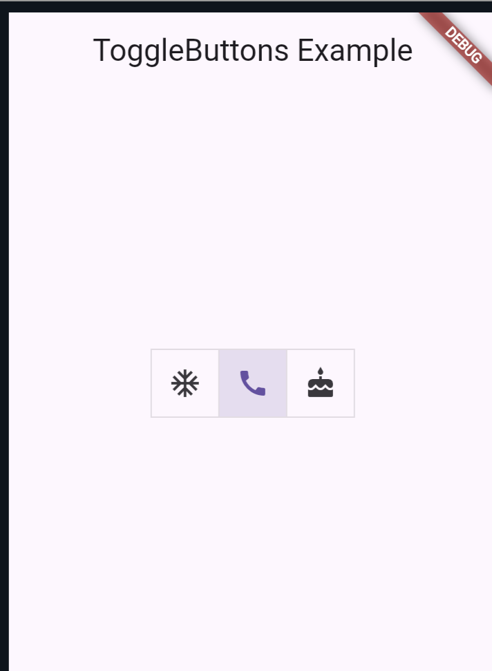
In this example, three toggle buttons are created using the ToggleButtons widget. The onPressed callback is used to update the state of each button.
3. Using the CupertinoSwitch Widget
The CupertinoSwitch widget is part of the Cupertino library and provides an iOS-style toggle button.
Example Code
import 'package:flutter/cupertino.dart';
import 'package:flutter/material.dart';

void main() => runApp(MyApp());

class MyApp extends StatelessWidget {
  @override
  Widget build(BuildContext context) {
    return MaterialApp(
      home: CupertinoSwitchExample(),
    );
  }
}

class CupertinoSwitchExample extends StatefulWidget {
  @override
  _CupertinoSwitchExampleState createState() => _CupertinoSwitchExampleState();
}

class _CupertinoSwitchExampleState extends State<CupertinoSwitchExample> {
  bool isSwitched = false;

  @override
  Widget build(BuildContext context) {
    return Scaffold(
      appBar: AppBar(
        title: Text('CupertinoSwitch Example'),
      ),
      body: Center(
        child: CupertinoSwitch(
          value: isSwitched,
          onChanged: (value) {
            setState(() {
              isSwitched = value;
            });
          },
        ),
      ),
    );
  }
}
Output:

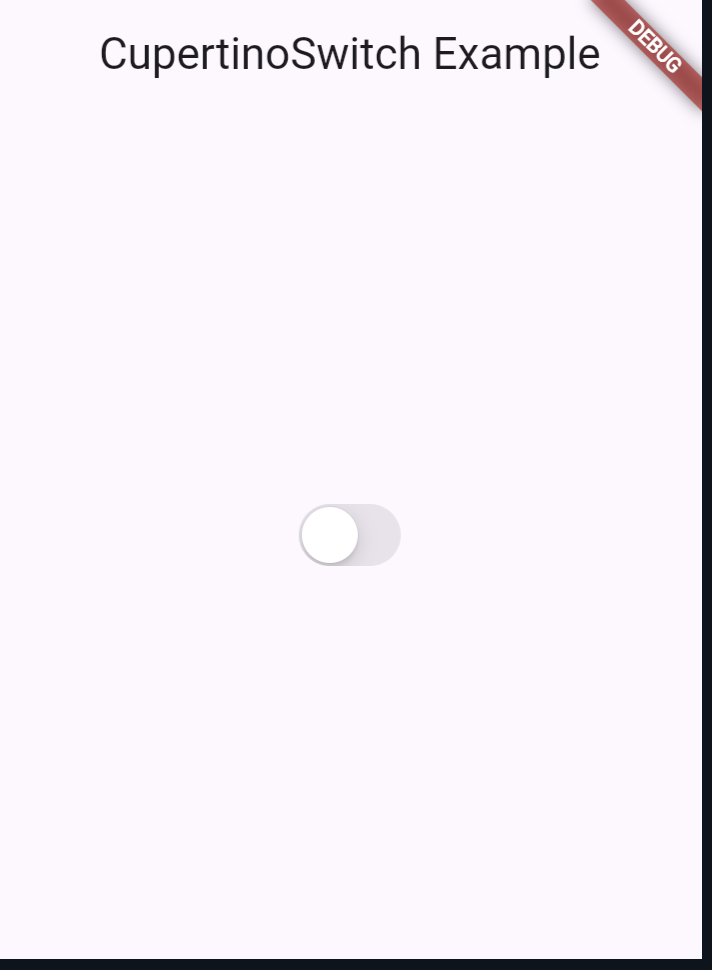
In this example, a CupertinoSwitch widget is used to create an iOS-style toggle button. The onChanged callback updates the state of the switch.
Also Read:
Conclusion
Creating toggle buttons in Flutter is straightforward with the various widgets available. Whether you’re using the Switch, ToggleButtons, or CupertinoSwitch widgets, you can easily implement toggle functionality in your app.
Each widget offers unique features and design styles, allowing you to choose the one that best fits your app’s needs. By following the examples provided in this blog post, you should be able to create and customize toggle buttons in your Flutter applications.
You can visit Flutter’s official documentation for more.
