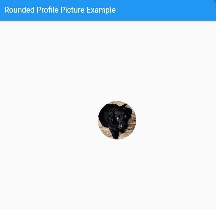
In this guide, we are going to use four different ways to create rounded profile pictures in Flutter.
CircleAvatar, ClipOval, BoxDecoration, and Custom Clippath are the 4 different ways to create a full-rounded profile image in your Flutter app.
If you haven’t already installed Flutter, you can follow the official: Flutter Installation Guide. to set it up.
Let’s get started.
Table of Contents

5 Ways to Make Rounded Profile Pictures in Flutter
Learn to create visually appealing rounded profile pictures in Flutter app, enhancing the user experience with modern circular avatar images.
Sure, here are complete code examples for each of the methods to create rounded profile pictures in Flutter:
1. Using the CircleAvatar widget
import 'package:flutter/material.dart';

void main() {
  runApp(MyApp());
}

class MyApp extends StatelessWidget {
  @override
  Widget build(BuildContext context) {
    return MaterialApp(
      home: Scaffold(
        appBar: AppBar(
          title: Text('Rounded Profile Picture Example'),
        ),
        body: Center(
          child: CircleAvatar(
            radius: 50.0,
            backgroundImage: NetworkImage(
              'https://picsum.photos/id/237/300/300',
            ),
          ),
        ),
      ),
    );
  }
}- The
CircleAvatarwidget is a built-in Flutter widget that provides a circular avatar with an image or background color. - It automatically handles the clipping and rounding of the image or background.
2. Using the ClipOval widget
import 'package:flutter/material.dart';

void main() {
  runApp(MyApp());
}

class MyApp extends StatelessWidget {
  @override
  Widget build(BuildContext context) {
    return MaterialApp(
      home: Scaffold(
        appBar: AppBar(
          title: Text('Rounded Profile Picture Example'),
        ),
        body: Center(
          child: ClipOval(
            child: Image.network(
              'https://picsum.photos/id/237/300/300',
              width: 100.0,
              height: 100.0,
              fit: BoxFit.cover,
            ),
          ),
        ),
      ),
    );
  }
}- The
ClipOvalwidget clips its child widget into an oval shape. - You can use it in combination with an
Imagewidget or aContainerwith a background image.
3. Using the BoxDecoration with borderRadius
import 'package:flutter/material.dart';

void main() {
  runApp(MyApp());
}

class MyApp extends StatelessWidget {
  @override
  Widget build(BuildContext context) {
    return MaterialApp(
      home: Scaffold(
        appBar: AppBar(
          title: Text('Rounded Profile Picture Example'),
        ),
        body: Center(
          child: Container(
            width: 100.0,
            height: 100.0,
            decoration: BoxDecoration(
              shape: BoxShape.circle,
              image: DecorationImage(
                image: NetworkImage('https://picsum.photos/id/237/300/300'),
                fit: BoxFit.cover,
              ),
            ),
          ),
        ),
      ),
    );
  }
}- You can use the
BoxDecorationwidget along with theborderRadiusproperty to create a rounded rectangle. - By setting a large
borderRadius, you can make the container look circular.
4. Using a custom ClipPath widget
ClipPath widget’s purpose and functionality, highlight its ability to create custom shapes for clipping child widgets in Flutter.
It emphasizes the widget’s significance in enabling unique designs and layouts with precise control over visual presentation.
import 'package:flutter/material.dart';

void main() {
  runApp(MyApp());
}

class MyApp extends StatelessWidget {
  @override
  Widget build(BuildContext context) {
    return MaterialApp(
      home: Scaffold(
        appBar: AppBar(
          title: Text('Rounded Profile Picture Example'),
        ),
        body: Center(
          child: ClipPath(
            clipper: CircleClipper(),
            child: Image.network(
              'https://picsum.photos/id/237/300/300',
              width: 100.0,
              height: 100.0,
              fit: BoxFit.cover,
            ),
          ),
        ),
      ),
    );
  }
}

class CircleClipper extends CustomClipper<Path> {
  @override
  Path getClip(Size size) {
    return Path()
      ..addOval(Rect.fromCircle(
        center: Offset(size.width / 2, size.height / 2),
        radius: size.width / 2,
      ));
  }

  @override
  bool shouldReclip(CustomClipper<Path> oldClipper) => false;
}- If you need more control over the shape of the profile picture, you can create a custom
ClipPathwidget. - This approach involves defining a custom
Pathand using it to clip the image or background.
Check Out:
- How to Remove Iconbutton Padding in Flutter?
- How to Add Border to Container in Flutter?
- How to Add Space Between Rows in Flutter?
- How to Show Custom Toast Messages in Flutter?
Output

Conclusion
In each example, the key part is using the respective widget or technique to create the rounded or circular shape for the profile picture.
The Center widget is used to position the profile picture in the center of the screen, and the Scaffold and AppBar widgets provide a basic app structure.
By specifying a path, areas outside of it are clipped, providing precise control over the visual presentation of UI elements, enabling unique designs and layouts with intricate shapes.
