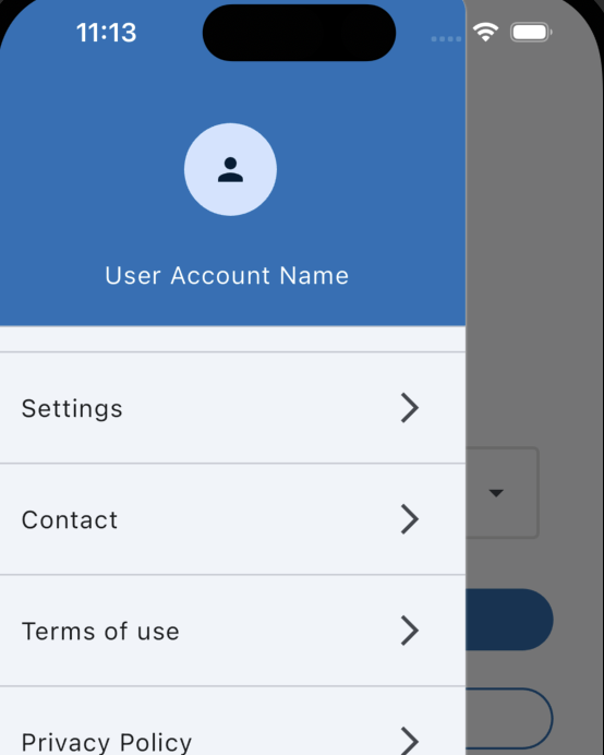
In this article, you will learn How to Make A Drawer for the Flutter Application, using a practical code example to illustrate the process of making a dynamic drawer.
Table of Contents
How to Make A Drawer in Flutter – Steps
Make A Drawer plays a crucial role in enhancing user experience by providing a seamless and organized way for users to navigate through different sections of an application.
These drawers offer a clean, compact menu accessible through a swipe or a button click, enabling users to effortlessly access app features without cluttering the main interface.

Understanding Flutter’s Drawer Widget
The Drawer widget in Flutter serves as a panel that slides in from the edge of the screen and typically contains a menu. It allows developers to add various components, such as ListTile, to construct a list of items.
Code Example of a Dynamic Drawer
Let’s dive into a practical example of implementing a dynamic drawer in a Flutter application using ListView and ListTile widgets. This code excerpt showcases the basic structure of a Flutter drawer.
import 'package:flutter/material.dart';

class DrawerSection extends StatelessWidget {
  DrawerSection({
    Key? key,
  }) : super(key: key);

  final List<String> drawerItems = [
    'Settings',
    'Contact',
    'Terms of use',
  ];

  @override
  Widget build(BuildContext context) {
    return Drawer(
      child: ListView.separated(
        padding: EdgeInsets.zero,
        itemCount: drawerItems.length + 1, // +1 for last item without divider
        separatorBuilder: (context, index) {
          return const Divider();
        },
        itemBuilder: (context, index) {
          if (index == 0) {
            return DrawerHeader(
              decoration: BoxDecoration(
                color: kPrimaryColor,
              ),
              child: const Column(
                mainAxisAlignment: MainAxisAlignment.spaceAround,
                crossAxisAlignment: CrossAxisAlignment.center,
                children: [
                  CircleAvatar(radius: 30, child: Icon(Icons.person)),
                  Text(
                    'User Account Name ',
                    style: TextStyle(color: Colors.white),
                  ),
                ],
              ),
            );
          }
          return ListTile(
              title: Text(drawerItems[index - 1]),
              trailing: const Icon(
                  Icons.arrow_forward_ios), // Adjusted index for the items list
              onTap: () {
                // Navigation logic for different drawer items
                if (index == 1) {
                  Navigator.pushNamed(context, SettingsPage.routeName);
                }
                if (index == 2) {
                // add. navigation routes of your page
                }
                if (index == 3) {
                // add. navigation routes of your page
                }
                if (index == 4) {
                // add. navigation routes of your page
                }

              });
        },
      ),
    );
  }
}
This code snippet checks the value of the index variable within a drawer list and triggers different navigation actions based on the index value. It uses separate if statements to determine the action to perform when a specific drawer item is tapped.
Here’s a breakdown of how this code functions:
- if Statements:
if (index == 1) { ... }checks if the index corresponds to the first item in the list.- If the condition is true (index equals 1), it triggers navigation to the ‘SettingsPage’ using
Navigator.pushNamed(context, SettingsPage.routeName). This assumes there’s a route namedSettingsPage.routeNamedefined in the app.
- If the condition is true (index equals 1), it triggers navigation to the ‘SettingsPage’ using
if (index == 2) { ... }examines if the index is for the second item in the list.- For index 2, there should be a specific navigation route defined for a corresponding page or screen. This block should have code that navigates to the designated screen using
Navigator.pushNamed.
- For index 2, there should be a specific navigation route defined for a corresponding page or screen. This block should have code that navigates to the designated screen using
- Similarly, subsequent
ifstatements check for other index values (3, 4, and so on) and should contain code that specifies navigation routes for their respective pages or screens.
Each if statement focuses on a particular index value and executes navigation logic based on the tapped item in the drawer.
Adjustments and specific navigation routes for each index should be provided within the corresponding if blocks to navigate users to different screens or functionalities within the app.
You can also use switch case for switch navigation like this:
onTap: () {
              // Navigation logic for different drawer items
              switch (index) {
                case 1:
                  Navigator.pushNamed(context, '/settings');
                  // Example navigation to 'Settings' screen
                  break;
                case 2:
                  Navigator.pushNamed(context, '/contact');
                  // Example navigation to 'Contact' screen
                  break;
                // Add cases for other items as needed
                default:
                  break;
              }
            },
The onTap function within the provided code is a part of a ListTile widget in Flutter. It’s used to define what happens when the user taps on an item within the drawer list.
The function contains a switch statement that checks the index of the tapped item within the drawer list and executes specific navigation logic based on the item’s index.
Here’s a breakdown of what this code snippet does:
- onTap Function:
onTap: () { ... }defines the action to take when aListTileis tapped.- Switch Statement:
switch (index) { ... }checks the value of theindexvariable to determine which drawer item was tapped.- Cases:
case 1:corresponds to the first item in the list. If the first item is tapped, it triggers navigation to the ‘Settings’ screen usingNavigator.pushNamed(context, '/settings').case 2:corresponds to the second item in the list. Tapping the second item initiates navigation to the ‘Contact’ screen viaNavigator.pushNamed(context, '/contact').- Additional
casestatements can be added for other drawer items to handle navigation to different screens. - The
defaultcase is provided for handling scenarios where the index doesn’t match any of the specified cases.
Essentially, when a drawer item is tapped, this function checks the index of the tapped item and performs specific navigation actions based on that index, such as directing the user to different screens within the app.
Adjustments can be made to accommodate more items by adding new cases within the switch statement for additional navigation destinations.
Output:

Exploring ListViews and Separators
ListView.separated is a useful widget in Flutter that aids in creating dynamic and scrollable lists with separators.
Implementing separators within the drawer’s ListView enhances visual organization and readability.
Adding Navigation Functionality
By incorporating onTap functions within ListTile items, we can facilitate navigation to various screens or functionalities upon user selection.
The code snippet enables navigation to different pages or sections within the app based on the selected drawer item.
Customization and Styling
Customization is key to creating an appealing user interface. Developers can modify the appearance of the drawer using various Flutter styling elements to match the app’s design and branding.
Enhancing User Interaction
Integrating gestures and animations within the dynamic drawer can significantly enhance user interaction and engagement. These elements contribute to a more intuitive and user-friendly experience.
Testing and Debugging
During the development process, it’s essential to conduct rigorous testing and address potential issues or bugs that may arise, ensuring a smooth and error-free user experience.
Optimizing Performance
Optimizing the dynamic drawer for performance involves streamlining code, reducing unnecessary operations, and ensuring the app’s responsiveness, leading to an efficient and seamless user interface.
Also, Read Related Tutorials
- Understanding the Essence of BuildContext in Flutter Development
- How to Add GitHub Co-Authors and Multiple Authors?
Conclusion
In conclusion, the implementation of a dynamic drawer in Flutter applications significantly improves user interaction, navigation, and overall user experience.
By following best practices, leveraging Flutter’s powerful widgets, and customizing the drawer’s appearance, developers can create an efficient and visually appealing dynamic drawer for their applications.
I hope you learned how to make a custom drawer for the Flutter application, using a practical code example.
