In this tutorial, we are going to learn to Customize Dropdown Button Using Dropdownbuttonformfield in Flutter.
In Flutter, DropdownButtonFormField is a widget that provides a dropdown menu of items and allows users to select one item from the list.

Steps to Customize the DropdownButtonFormField in Flutter
- Step 1: Create a
StatefulWidgetclass to manage the state of the dropdown. - Step 2: Inside the
StatefulWidgetclass, initialize the following:- A nullable
Stringvariable to store the selected value. - A
Listof options to be displayed in the dropdown.
- A nullable
- Step 3: In the
buildmethod of theStatefulWidget, wrap theDropdownButtonFormFieldwith aPaddingwidget to add padding around it. - Step 4: Customize the
DropdownButtonFormFieldusing the following properties:value: Set the current selected value.hint: Set a hint text to be displayed when no value is selected.icon: Customize the dropdown icon using anIconwidget.iconSize: Set the size of the dropdown icon.elevation: Set the elevation value to make the dropdown appear raised.style: Set the text style for the selected value.decoration: Customize the decoration of the dropdown usingInputDecoration.labelText: Set a label for the dropdown.border: Set the border style for the dropdown (e.g.,OutlineInputBorder).
- Step 5: Set the
onChangedcallback to update the selected value when an option is selected. - Step 6: Create a
mapfunction to convert the list of options toDropdownMenuItemwidgets.- Inside the
mapfunction, create aDropdownMenuItemfor each option, setting thevalueandchildproperties.
- Inside the
- Step 7: Call the
toList()method on themapfunction to convert it to a list ofDropdownMenuItemwidgets. - Step 8: Assign the list of
DropdownMenuItemwidgets to theitemsproperty of theDropdownButtonFormField.
By following these steps, you can customize the appearance and behavior of the DropdownButtonFormField according to your requirements.
Full Code – Customize Dropdown Button Using Dropdownbuttonformfield
import 'package:flutter/material.dart';

void main() {
  runApp(MyApp());
}

class MyApp extends StatelessWidget {
  @override
  Widget build(BuildContext context) {
    return MaterialApp(
      title: 'Dropdown Button FormField Demo',
      home: Scaffold(
        appBar: AppBar(
          title: Text('Dropdown Button FormField'),
        ),
        body: Center(
          child: CustomDropdownFormField(),
        ),
      ),
    );
  }
}

class CustomDropdownFormField extends StatefulWidget {
  @override
  _CustomDropdownFormFieldState createState() => _CustomDropdownFormFieldState();
}

class _CustomDropdownFormFieldState extends State<CustomDropdownFormField> {
  String? _selectedValue;
  final List<String> _options = ['Option 1', 'Option 2', 'Option 3'];

  @override
  Widget build(BuildContext context) {
    return Padding(
      padding: const EdgeInsets.symmetric(horizontal: 16.0),
      child: DropdownButtonFormField<String>(
        value: _selectedValue,
        hint: Text('Select an option'),
        icon: Icon(Icons.arrow_drop_down),
        iconSize: 24,
        elevation: 16,
        style: TextStyle(color: Colors.deepPurple),
        decoration: InputDecoration(
          labelText: 'Options',
          border: OutlineInputBorder(
            borderRadius: BorderRadius.circular(10.0),
          ),
        ),
        onChanged: (String? newValue) {
          setState(() {
            _selectedValue = newValue;
          });
        },
        items: _options.map<DropdownMenuItem<String>>((String value) {
          return DropdownMenuItem<String>(
            value: value,
            child: Text(value),
          );
        }).toList(),
      ),
    );
  }
}
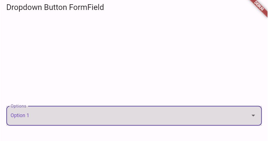
In this example, we’ve customized the following aspects of the DropdownButtonFormField:
- Padding: We’ve added some horizontal padding around the dropdown using
Paddingwidget. - Hint Text: We’ve set a hint text using the
hintproperty. - Icon: We’ve changed the dropdown icon to an
Icons.arrow_drop_downicon and increased its size using theiconSizeproperty. - Elevation: We’ve added an elevation of 16 to make the dropdown appear raised.
- Text Style: We’ve changed the text style of the selected value using the
styleproperty. - Decoration: We’ve customized the decoration of the dropdown using the
decorationproperty. In this case, we’ve added a label and an outline border with a radius of 10.
Output of Customize Dropdown Button Using Dropdownbuttonformfield

Related Reading:
End of Customize Dropdown Button Using Dropdownbuttonformfield
You can further customize the appearance by changing the values of these properties or adding additional widgets within the DropdownButtonFormField.
If you haven’t already installed Flutter, you can follow the official: Flutter Installation Guide. to set it up.
