In this tutorial, we’ll guide you through the process of implementing Borders to Textfield in Flutter. Text fields are a fundamental part of many mobile apps, allowing users to input data efficiently.
Table of Contents

Add Borders to Textfield in Flutter with Examples
Before we begin, ensure that you have Flutter installed on your development environment. If you haven’t already installed Flutter, you can follow the official: Flutter Installation Guide. to set it up.
Example 1: Two Input Fields with Border and Submit Button
import 'package:flutter/material.dart';

void main() {
  runApp(MyApp());
}

class MyApp extends StatelessWidget {
  @override
  Widget build(BuildContext context) {
    return MaterialApp(
      home: Scaffold(
        appBar: AppBar(
          title: Text('TextFields with Borders'),
        ),
        body: Center(
          child: Padding(
            padding: const EdgeInsets.all(20.0),
            child: Column(
              children: [
                TextFieldWithBorder(labelText: 'Enter Your First Name'),
                SizedBox(height: 20),
                TextFieldWithBorder(labelText: 'Enter Your Last Name'),
                SizedBox(height: 20),
                SizedBox(
                  width: double.infinity,
                  child: ElevatedButton(
                    onPressed: () {
                      // Implement your submit button logic here
                      print('Submit button pressed');
                    },
                    child: Text('Submit'),
                  ),
                ),
              ],
            ),
          ),
        ),
      ),
    );
  }
}

class TextFieldWithBorder extends StatelessWidget {
  final String labelText;

  const TextFieldWithBorder({required this.labelText});

  @override
  Widget build(BuildContext context) {
    return TextField(
      decoration: InputDecoration(
        border: OutlineInputBorder(), // Add border here
        labelText: labelText,
      ),
    );
  }
}
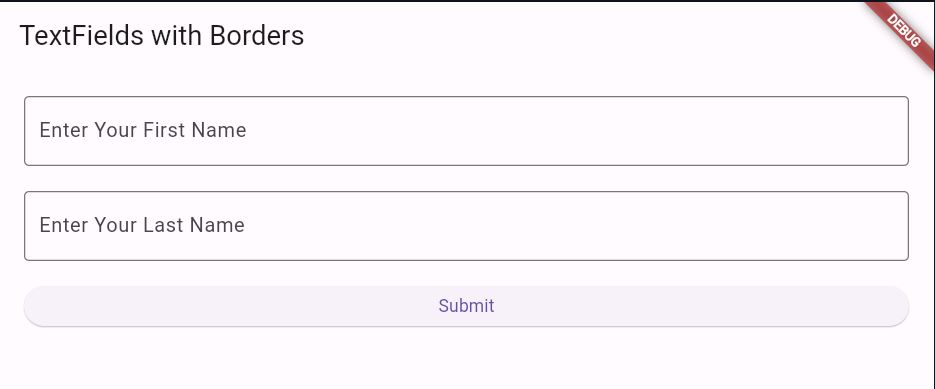
Output

Example 2: One Input Field with Border and Submit Button
import 'package:flutter/material.dart';

void main() {
  runApp(MyApp());
}

class MyApp extends StatelessWidget {
  @override
  Widget build(BuildContext context) {
    return MaterialApp(
      title: 'TextField Border Example',
      home: Scaffold(
        appBar: AppBar(
          title: Text('TextField Border Example'),
        ),
        body: Center(
          child: Padding(
            padding: const EdgeInsets.all(16.0),
            child: Column(
              mainAxisAlignment: MainAxisAlignment.center,
              children: [
                TextField(
                  decoration: InputDecoration(
                    border: OutlineInputBorder(
                      borderRadius: BorderRadius.circular(20.0),
                      borderSide: BorderSide(color: Colors.grey, width: 2.0),
                    ),
                    enabledBorder: OutlineInputBorder(
                      borderRadius: BorderRadius.circular(20.0),
                      borderSide: BorderSide(color: Colors.grey, width: 2.0),
                    ),
                    focusedBorder: OutlineInputBorder(
                      borderRadius: BorderRadius.circular(20.0),
                      borderSide: BorderSide(color: Colors.blue, width: 2.0),
                    ),
                    filled: true,
                    fillColor: Colors.grey.shade200,
                    hintText: 'Enter some text',
                  ),
                ),
                SizedBox(height: 16.0),
                SizedBox(
                  width: double.infinity, // Make the button full-width
                  child: ElevatedButton(
                    onPressed: () {
                      // Handle submit button press
                    },
                    child: Text('Submit'),
                  ),
                ),
              ],
            ),
          ),
        ),
      ),
    );
  }
}
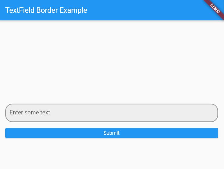
Output

End of Borders to Textfield in Flutter
In this tutorial, we’ve covered the basics of creating text fields with borders in Flutter. By using the TextField widget and customizing its decoration, you can easily create text fields with various styles to suit your application’s design.
Experiment with different properties of the InputDecoration class to further customize the appearance of your text fields.
Want to learn How to Show Custom Toast Messages in Flutter?
