This blog will guide you through the basics of using Flutter Radio Button, along with a practical example. In Flutter, radio buttons are simple to implement and highly customizable.
Table of Contents

What is a Flutter Radio Button?
A radio button is a round button that allows the user to select one option from a set. Typically, radio buttons are used when you want the user to choose a single option from a small number of choices.
Using Flutter Radio Button
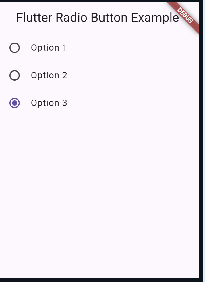
In Flutter, the Radio widget is used to create radio buttons. Here’s a simple example:
import 'package:flutter/material.dart';

void main() => runApp(MyApp());

class MyApp extends StatefulWidget {
  @override
  _MyAppState createState() => _MyAppState();
}

class _MyAppState extends State<MyApp> {
  int _selectedValue = 0;

  @override
  Widget build(BuildContext context) {
    return MaterialApp(
      home: Scaffold(
        appBar: AppBar(title: Text('Flutter Radio Button Example')),
        body: Column(
          children: <Widget>[
            ListTile(
              title: Text('Option 1'),
              leading: Radio(
                value: 1,
                groupValue: _selectedValue,
                onChanged: (int? value) {
                  setState(() {
                    _selectedValue = value!;
                  });
                },
              ),
            ),
            ListTile(
              title: Text('Option 2'),
              leading: Radio(
                value: 2,
                groupValue: _selectedValue,
                onChanged: (int? value) {
                  setState(() {
                    _selectedValue = value!;
                  });
                },
              ),
            ),
            ListTile(
              title: Text('Option 3'),
              leading: Radio(
                value: 3,
                groupValue: _selectedValue,
                onChanged: (int? value) {
                  setState(() {
                    _selectedValue = value!;
                  });
                },
              ),
            ),
          ],
        ),
      ),
    );
  }
}
Explanation
In the above example, we have a stateful widget _MyAppState where:
_selectedValueholds the currently selected radio button’s value.- Each
ListTilecontains aRadiowidget with avalueand agroupValue. - The
onChangedcallback updates the_selectedValuewhenever a radio button is selected, and the UI is rebuilt with the new selection.
Output:

Customizing Flutter Radio Button
You can customize radio buttons to better fit your app’s design. For example, you might want to change the color of the selected radio button:
Radio(
  value: 1,
  groupValue: _selectedValue,
  onChanged: (int? value) {
    setState(() {
      _selectedValue = value!;
    });
  },
  activeColor: Colors.red,
);
In this example, RadioListTile simplifies the code by combining ListTile and Radio. The properties title, value, groupValue, and onChanged function similarly to the previous example but are wrapped in a single widget for cleaner code.
Advanced Use Case: Using Enums with Flutter Radio Button
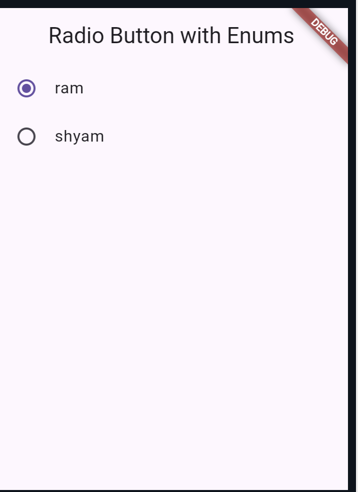
Using enums with radio buttons can make your code more readable and maintainable, especially when dealing with multiple options:
import 'package:flutter/material.dart';

enum SingingCharacter { ram, shyam }

class MyApp extends StatefulWidget {
  @override
  _MyAppState createState() => _MyAppState();
}

class _MyAppState extends State<MyApp> {
  SingingCharacter _character = SingingCharacter.ram;

  @override
  Widget build(BuildContext context) {
    return MaterialApp(
      home: Scaffold(
        appBar: AppBar(title: Text('Radio Button with Enums')),
        body: Column(
          children: <Widget>[
            ListTile(
              title: const Text('ram'),
              leading: Radio<SingingCharacter>(
                value: SingingCharacter.ram,
                groupValue: _character,
                onChanged: (SingingCharacter? value) {
                  setState(() {
                    _character = value!;
                  });
                },
              ),
            ),
            ListTile(
              title: const Text('shyam'),
              leading: Radio<SingingCharacter>(
                value: SingingCharacter.shyam,
                groupValue: _character,
                onChanged: (SingingCharacter? value) {
                  setState(() {
                    _character = value!;
                  });
                },
              ),
            ),
          ],
        ),
      ),
    );
  }
}

void main() => runApp(MyApp());
Explanation
In this example, we use an enum SingingCharacter to define the options. This approach improves code readability and ensures type safety, making it easier to manage the radio button options.
Output:

Also read:
Conclusion
Radio buttons are an essential part of many applications, providing a simple and intuitive way for users to make a single choice from a list of options.
In Flutter, implementing radio buttons is straightforward and flexible. With widgets like Radio and RadioListTile, you can create clean and efficient UIs that enhance the user experience.
